My Music magazine uses the conventions of Blender Magazines January 2009 edition. Blender is a existing music magazine, although they do not follow these conventions each edition, I believe My magazine could use a similar layout and use it as their house style. However I have decided to have my masthead layout differently to the way they do. They have their across the whole top of the cover, behind their cover image, I wanted my masthead to be in front of my cover image and not go as far across the top. Another thing I wanted to make different to blender was the image, the one they used could be said to be provocative and cuts their target audience off to only older music fans. I wanted to have a variety of music fans, so I choose to use a more age appropriate image.
My magazine represents the music industry as a whole. I tried not to base my magazines content around only 1 style of music, I have tried to make sure theirs content on all areas of the music industry, for example I have included content on a acoustic guitar star, a rock group, an alternative Indy band, a pop singer ect.
My target audience for my music magazine are musical fans in general, the layout design has been made with people aged 14-25 in mind, however the content and images could interest a wide variety of people. By making my magazine have content on all styles of music, I make my target audience larger. For example if I only showed rock band content, I would only attract rock band fans, but by making it include lots of music styles, It will attract lots of different fans.
I attracted my audience by having stories and interviews with top and interesting musicians that are popular now. Another way I attracted my audience was by making the text very bold and colourful so it stands out off the page. When on stands in shops the magazine will stand out and draw people to it without them even seeing the images or reading the text.
As my magazine is on a topic which is popular at the moment, it has lots of opportunities to work with different media institutions. As it’s a Music magazine it will sell lots of units on a regular monthly basis, so it would be involved with a printing, producing and distributing institution. Also it could be a success when working in partnership with an internet institution, the magazine could have a website which features photographs, video interview, album and concert reviews and online subscriptions ect. As the magazine is music related it could have a connection with a television institution and work with a music channel which shows the music videos of the people featured in the magazine. Also as the magazine is targeted at music fans, most people interested in music use electrical devices such as ipods and laptops to listen to it. The magazine could have a connection with a distribution institution which distributes it electronically to the devices that people actually listen to their music on.
For my music magazine I wanted the front cover to have more images so that it had a very different layout to the college magazine front cover. However I found it hard to use many images with text and still keep the layout looking neat and tidy. So I decided to compromise and have the front cover using only 1 key image and using more than 1 image on the contents page.
Similarly to my college magazines draft layouts, I made very detailed plans of how I wanted my music magazine to look and address my audience. So my final products were very similar to the plans I had made. However in my draft layouts I wasn’t very precise with the colours, so this is something that was worked on during production.
Time management wasn’t as much as an issue for my music magazine as it was for my college magazine. I spent a fair amount of time researching existing magazines, and planning my own. I left myself enough time to produce and develop my magazine with time to perfect the layout and such things.
Wednesday, 31 March 2010
Completed Music Magazine Double Page Spread
I am happy with the finished double page spread. The design is simple and generally nice to look at. The fonts are easy to read, even though they are in a small pt size. In my opinion I have used just the right amount of images with out overflowing the page. The quote isn’t really revealing or scandalous in the way quotes are normally used in magazines. But I found that my magazine was about music and didn’t need to have scandalous texts.
If I had to do my double page spread again, I would look more closely at my text. The text at the moment is good, but it could be improved and made more interesting. The text tells the reader about himself and his music, but what does the reader really want to read about? Next time I would spend more time researching what people actually want to read about.
Completed Music Magazine Double Page Spread

Double Page Spread Progress
This week I have been working on my double page spread. I have 3 text boxes which I have linked together so that the text flows from each. I have also used a circle image over text so I had to use text wrap, also to make the image stand out more I have used a red outline. I wanted to make the quickfire round answers to look like they were hand written, the font I used is quite realistic in my opinion. The colour of the fonts and lines on the page are similar to the ones on the other work, I think this worked out in my favour. In magazines not every page has the same fonts and colours, so this shows this in my magazine.
Decisions
Today I have written the text for my music magazine double page spread. I have made it as a question and answer interview, as in my research I found that readers prefer this. I have also included a quick fire round of short and simple questions to show some text that isn’t necessarily music related.
Here is the text
Stepping out from his big brothers shadow, Craig Mayor is here to stay! With his brothers band: The Reckless Rockers dominating the music charts for the past 7 weeks, with 5 years experience behind them, Craig’s first single knocked them off the top spot just weeks after it was released. In the past Craig has been known as the little brother of a rocker, but now he’s proved himself as an excellent musician who’s here to stay.
Wow, you’ve had a great introduction to the music industry, how does it feel to knock your brother off the top spot? Well tbh it’s brilliant that people like my music and have got it to the top spot, but there’s no competition with myself and my brothers band. We have completely different sounds, we support each other completely. I mean I’ve learnt everything I know about music from lee so it’s like something we share and have in common.
For people who haven’t heard your music, how are you different to The Reckless Rockers? I think we have a completely different sound. They [the reckless rockers] are more rock and loud, whereas I tend to make more mellow acoustic music, there songs are mostly written for them, but I write my own from my life experiences.
Are you surprised how quickly your fan base has built up? Yeah definitely, it was only last year I was a kid in college making YouTube covers in my spare time. Now I get to make music full time and get paid for it which is a plus. It makes it just so more fun when you no people are enjoying your music to.
Wow, things have moved fast for you then. How did you get recognised? Well I have my brother to thank for that, I was visiting him at one of his recording sessions, and there was an acoustic guitar sat there, so obviously I started playing and my brother’s manager walked in with some of his friends. Turns out his friend was starting a new label and was looking for new artists, he invited me to come play for him, and I was signed within 3 meetings.
Your sound is different to what we normally see in the charts, who are your musical influences? I have a lot of respect for many musicians, but I think artists who play a lot of acoustic music inspire me. Artists such as John Mayer, James Morrison and James Blunt. Their lyrics are meaningful and have a purpose where some singers are just in it to sell records.
Since the success youve had from your single, do you plan on releasing and album? Yeah, I’ve been working really hard getting some songs down. I’m actually recording a couple of the tracks later this week, were lucky to be working with some great producers so hopefully the fans will really like it, and have the success of the single.
Quick Fire round for the fans to get to know you
Favourite colour: blue, no no umm green
Favourite food: everything, haha pasta
Favourite song: Who says - John Mayer
Best childhood memory: Ohh there’s so many, umm the summer family holidays down by the lake, camping and playing guitar under the sunset
Favourite country: I haven’t really travelled much, but I’ve been to LA and that was nice so, America
I have also chosen my images for the music magazine double page spread. I am going to use 3 images, some of them our music related, where others are not to keep it balanced. I am making my double page spread on the programme quark, there colours and text effects are different to that on Photoshop so it will be hard to carry on the conventions from the front cover and contents page, but I will try to make them as similar as possible.
Images i am going to use on my double page spread


Completed Music Magazine Contents Page
The past few days I have been making my contents page on Photoshop. Its taken me so long as each image, text and shapes are on separate layers. I have used the same font and colour scheme which I used of the front cover, this Is to carry on the conventions of the magazine and make the magazine flow more easy.
I am pleased with my music magazine contents page. Just by looking at the contents page the reader can tell that the magazine is connected to music as I have used a medium shot of a person holding a guitar, and also an extreme long shot of a concert. I also like that the contents is in numerical order, some contents I looked at during my research there was no order to the contents page, but my contents is in order, making it easy to follow and read. By using the same font and colour scheme you can really see the connection between my front cover and contents page, this is something I would like to happen with my double page spread.

I am pleased with my music magazine contents page. Just by looking at the contents page the reader can tell that the magazine is connected to music as I have used a medium shot of a person holding a guitar, and also an extreme long shot of a concert. I also like that the contents is in numerical order, some contents I looked at during my research there was no order to the contents page, but my contents is in order, making it easy to follow and read. By using the same font and colour scheme you can really see the connection between my front cover and contents page, this is something I would like to happen with my double page spread.
Completed Music Magazine Contents Page

Image Choices for Contents Page
Today I designed my music magazine contents page. I have made the layout similar to the metal hammer magazines contents pages which I have looked at in my research, but am going to include more images. I have chosen to use 3 images in my contents page.
Contents Page Images


Completed Music Magazine Front Cover
Today I have completed my music magazine front cover, I am pleased with the overall appearance. The page is not empty, but also not crammed with information. I have created my own house style by using this symbol > before each strap line and by placing a black separating line between different stories. The key image Is also connected with the publication date. The image clearly has an autumn setting, which connects with the October release.
If I had to do it again I think I would change the positioning of the masthead. I would place it behind the head of the person in the picture (this would have to be done cleverly on Photoshop). Another change I would probably make is the image; I would use and image that clearly emphasises music (I.e. playing an instrument or in a recording studio.) This way your audience straight away no’s the magazine is music related without even having to look at the masthead.

If I had to do it again I think I would change the positioning of the masthead. I would place it behind the head of the person in the picture (this would have to be done cleverly on Photoshop). Another change I would probably make is the image; I would use and image that clearly emphasises music (I.e. playing an instrument or in a recording studio.) This way your audience straight away no’s the magazine is music related without even having to look at the masthead.
Completed Music Magazine Front Cover

Front Cover so far
Over the past few weeks I have been constructing my music magazine font cover. This takes so long as each piece of text of shape is on an individual layer. The stage that I’m on at the moment looks ok, but the page looks lopsided as 1 side is full of text whereas the other is just background image. To improve this i am going to add text down the right hand side to.

Improvements Needed

Image Choice and Layout
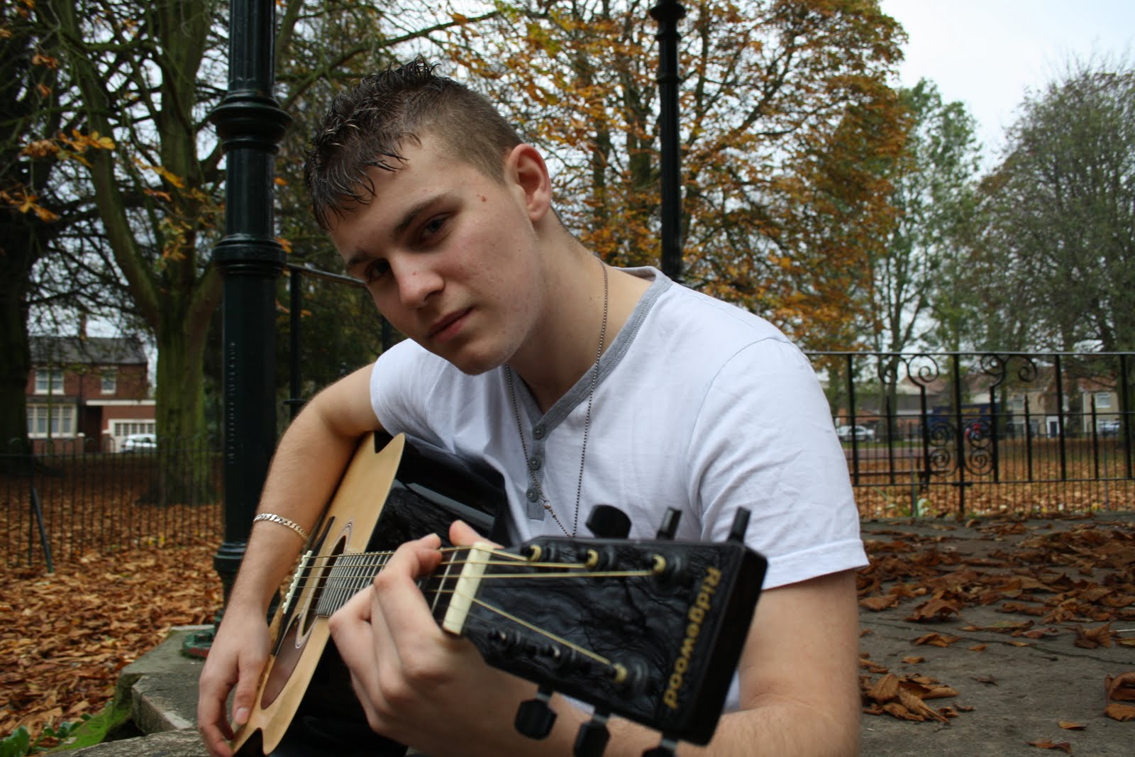
Today I have designed my front cover layout for my music magazine.I decided to use a simplistic approach to photographs, and only use 1 simple key image to advertise the main story, (without feature photographs) so as not to clutter the page. The image I have used matches with the strapline “smashing out of the shadows”
Image for Music Magazine Front Cover

Image for Music Magazine Front Cover

Research and Name Change
Today I made and asked people to complete a questionnaire on general magazine research. I have found that most prefer posters to gig reviews. The phrases “free” and “sex” would make a person want to buy a magazine if they saw it on the front cover. I should have a question and answer interview for my headline story. My magazine should have exclusive stories. I am going to take my findings and carefully consider how to take the comments and finding on board.
I have also decided today to change the name of my music magazine. Gq-m will narrow my target audience down to just males. I want something that isn’t precise to a certain group of people or style of music. So I am going to call it beat. I have chosen to make my masthead in font Jamiroquai and for it to be black and red.

I have also decided today to change the name of my music magazine. Gq-m will narrow my target audience down to just males. I want something that isn’t precise to a certain group of people or style of music. So I am going to call it beat. I have chosen to make my masthead in font Jamiroquai and for it to be black and red.
Completed Masthead

Name and Masthead
I have decided to name my music magazine GQ-M (Gentleman’s Quarterly Music Edition). GQ is an existing magazine, but this will be a separate magazine solely dedicated to music but will still be part of the GQ brand. I can make a similar masthead and then edit it to have music on the end. I can also follow the conventions of the magazine and use them for my own : (masthead either behind or in front of image, star at top right, Box to the middle right).
Today I made my 1st attempt at a masthead. I did this on Photoshop using layers and selection tools. This is how I made the letters g,q + m slightly overlap each other the same way the GQ masthead does.


Today I made my 1st attempt at a masthead. I did this on Photoshop using layers and selection tools. This is how I made the letters g,q + m slightly overlap each other the same way the GQ masthead does.
The existing GQ Masthead
My first attempt at masthead

Research and Decisions
I have been looking at the front cover layouts of other music magazines. I prefer the layouts which are more simple and do not have too many pictures. Just simple a simple image which has the majority of the space and smaller cover lines and sell lines around the image. I like the conventions set out in blender magazine, and would like to use similar in my own magazine, however i will be using a more age appropriate image

I also printed a page of fonts in different sizes from quark. I tested 17 fonts in sizes 12pt, 14pt and 18pt. For my double page spread 18pt will be too small for my masthead. Also 12pt on some fonts is still to big for the text, from looking at other magazines the use around 8pt or 10pt. I choose Lucinda Sans to be the font of my text. It is simple and easy to read even when in a small pt size.

I also printed a page of fonts in different sizes from quark. I tested 17 fonts in sizes 12pt, 14pt and 18pt. For my double page spread 18pt will be too small for my masthead. Also 12pt on some fonts is still to big for the text, from looking at other magazines the use around 8pt or 10pt. I choose Lucinda Sans to be the font of my text. It is simple and easy to read even when in a small pt size.
Image Choices
Today I’ve been deciding on which images I am going to use in my music magazine. I have narrowed it down to about 12 photos, and will need to decide which fits best and then narrow it down again to about 5 photos.
I have also been making spider diagrams with lot’s of names for my music magazine. Because my magazine will cover lot’s of ranges of music I don’t want the masthead to be to specific. I have tried to keep the names short sometimes abbreviations like MATM (music at the moment) and GQM (great quality music).
I have also been making spider diagrams with lot’s of names for my music magazine. Because my magazine will cover lot’s of ranges of music I don’t want the masthead to be to specific. I have tried to keep the names short sometimes abbreviations like MATM (music at the moment) and GQM (great quality music).
Images for Music Magazine


Music Magazine Research and Decisions
Today i have made decisions concerning my Music Magazine: for the front cover of my music magazine I am going to use either a medium close up shot or a long shot with the celebrity at eyeline (looking straight at the camera/reader) because I think it will attract the readers attention more that with the eyes just looking to the side.
I have also looked at examples of double page spreads, I have decided that I am going to use a question and answer type interview, the question’s can be in a small bold font, with the answer slightly bigger not bold.
I have also looked at examples of double page spreads, I have decided that I am going to use a question and answer type interview, the question’s can be in a small bold font, with the answer slightly bigger not bold.
College Magazine Evaluation
My College Magazine follows the conventions of college and lifestyle magazines that are already on the market, these are: 1 cover image that matches with the magazine (for example wedding magazines have images of dresses) I have used a conventional picture of a person happily working in a class room connecting the magazine to education. I have Included a barcode, price and issue number. I have also used sell lines as to keep the magazine simple and clear
Not only have I followed the conventions of real media products but I have also challenged them. Normally in college or lifestyle magazines the contents page is kept simple with minimal images whereas I have took the unconventional route and placed many images on my contents page. I have done this to show the wide range of topics shown throughout the magazine as it does not just cover 1 genre (for example - gardening). But I have placed the contents in a conventional way (numerical order).
My college magazine represents college students and
The college itself. The magazines content revolves around academic topics and everyday events that happen around college, such as sporting events and new equipment being installed.
As my magazine is for college students, and will cover similar college related topics each month, This will limit the kind of media institutions who would be interested in being involved with my magazine. The main media institution will be the company which produces and distributes my magazine on large scale. My magazine also has the potential to work with Internet based institutions. The magazine could generate more interest by having a website which allows people to view the magazine online, as the magazine is free this will not impact sales.
The target audience for my college magazine would be college students, whether they be teenagers or older people coming back to college. I attracted my target audience by keeping the design simple and sleek without overdoing it on the graphics side of things. I kept the images happy and the colour schemes nice and easy on the eye.
In making my magazine I have learnt how to use such programmers as Photoshop and Quark. I have learnt how the best way to create a magazine front cover is on Photoshop, but also to put each individual piece of text and image on separate layers so they can be moved and edited easily. A problem I have found is that colours on quark have to be made by you; there is a list of preset colours which you have to go through and choose to save.
During making my magazine I had trouble choosing a suitable front cover image. I didn’t have a suitable portrait image which I could use to cover the whole cover. To solve this I used a landscape image which showed two students, one working happily but the other was looking confused, this wasn’t the kind of image I wanted to display on my front cover. So using Photoshop I cropped and stretched the image so that it covered the whole cover and that the image enhanced the magazines appearance.
When I was planning my magazines I had a very clear image of how I wanted my finished pieces to look, so I drew a detailed layout that showed the exact wording and position of my text. My final product ended up being nearly identical to my plan, with just a few simple layout differences.
Time management was an issue with this magazine. I believe I spent to much time planning and perfecting the magazine before I had even started to produce it on a computer. I should have drew a rough draft, but then perfected and spent more time designing the layout whilst actually on a computer working on it.
Since working on my college magazine I have become more aware and able to follow the conventions of magazines. I have more understanding why the masthead normally is on the top, left hand corner, why tag and sell lines are used, the kind of images you need to use to promote the styles and content of my magazine.
Completed College Magazine Contents Page
Overall I am happy with my college magazines contents page, it has lots of information and conventionally is in numerical order. I find this the best way top organise a contents page. The page is easy readable and very informative. Looking at the magazine now, the page does seem very busy, maybe crammed In places. Also some of the font pt size could have been made smaller. But overall the images match the text and the contents page does what it is meant to do.
Completed College Magazine Contents Page


Research
This week I have been planning my college magazines contents page layout. Traditionally college and lifestyle magazines do not have to many images on their contents page, but as my magazines covers a wide range of things I think it would be best to include many images.
Like the others I have made my college contents page on Photoshop with everything on layers of their own, this can get really repetitive and time consuming, but its really the only good way to do it.
Like the others I have made my college contents page on Photoshop with everything on layers of their own, this can get really repetitive and time consuming, but its really the only good way to do it.
Completed College Magazine Front Cover
This week I have been creating my college magazine on Photoshop. I have found it easiest and best to put each individual piece of text or image on their own layer. That way you have more control where you move things and how you can edit them.
I am pleased with my completed college magazine front cover. The masthead is really bold and it’s the first thing you notice. Second is the cover image, this I am really pleased with. By taking the photograph in a class room but also by having the subject smiling and looking happy to be there is great, It really emphasises to the reader that the magazine is a college magazine with a connection to education. The cover lines to really match with the magazine too.
If I was to redo the front cover I would change the font style. At the moment its really bold and captures the readers attention, but this is not really necessary, the magazine is free the cover lines do not have to sell the magazine. With other college and life style magazines I have looked at, the front page is still much simper than my own.
Finished College Magazine Front Cover

Tuesday, 30 March 2010
College Magazine Choices
Today I have chosen the images for my college magazines front cover and contents page. For the front cover I am using 1 cover image to advertise the headline story. For the contents page I am using 5 images, this is not normally done for college/life style magazines, but in my opinion it looks okay and doesn’t overflow the page. I have also designed the front cover layout. The text fits perfectly around my image, the black and then white format really makes the page flow and gives the magazine an interesting house style.

Images for contents page


Main cover image

Images for contents page


Brain Storming
Today I have brainstormed some masthead ideas for my college magazine. I decided that i didn’t want anything that is too particular (like sports weekly) as it would limit the target audience which I do not want to do. I decided on the name Up2Date. This way I can cover many topics in my magazine both educational and new things and events happening at the time.
I have also chosen the story lines which I want to put on the front cover of my college magazine. I have tried to think of things that match with the masthead Up2Date, some include How to be a good student, EMA eligibility and graphic department win award.
Another thing I decided on was my font style. I have chosen a font called Tahoma as it is easy to read and the first to catch your eye on a page full of fonts. The Fonts will be in black with a white outer glow and white with a black outer glow.
College Magazine Research
Today I have been doing research for my college magazine. There are not many college magazines out there so I have also looked at some life style magazines which I thought would have similar conventions. I have noticed with college/life style magazines they seem to keep the front cover simple with 1 cover image and the rest text. I have also noticed that most college magazines are free, this is something I would like to do with my own college magazine.
 The contents pages are also simpler than most magazines. They have neutral colour backgrounds and are normally in numerical order. The two contents pages that I looked at both had only 3 images on them, and clear easy readable fonts.

 The contents pages are also simpler than most magazines. They have neutral colour backgrounds and are normally in numerical order. The two contents pages that I looked at both had only 3 images on them, and clear easy readable fonts.
Photoshop & Quark
Today I learnt how to use the program Quark; this is the program I will be making my magazines on, alongside Adobe Photoshop. I’ve learnt that when I make my magazine I have to be aware that when its printed I will loose about 5mm off of each edge, so to make sure I compensate for this is can put some margins in and work from them.
Originally I was going to use a mixture of colours to make my magazine bright and bold, but looking at the conventions of other magazines I think this would make it look too tacky and not appeal to buyers so I’m going to stick to a colour scheme of maybe 2-3 colours.
Some problems I have noticed on quark are the fonts and colours. The fonts seem a little simple to use for the masthead and the colours you have to choose and make your self. I wanted my masthead to really stand out and to be interesting, to fix this I am going to open them in Photoshop, put some affects on them (maybe using layers?) and then paste them back into quark as an image.
I want my magazines to have a recognizable logo / picture, maybe something that blends in with my masthead. To do this I am going to try and create this in Photoshop. I could try incorporating this logo into a letter.
My Task
My task is to construct a College magazine front cover and contents page, a Music magazine front cover, contents page and double page spread. both magazines must feature 4 of my own images. I also have to produce a scrapbook of planning and a blog evaluating my progress.
In today’s lesson i looked at everything that needs to go into my scrap book: I need examples of front pages, contents pages and double page spreads, I then need to do some textual analysis, the different ways stories are written and presented. I also need to include my planning in there: rough drafts of my stories, what the stories are going to be about, my colour schemes.
I found out that the deadline for both my college and music magazines is the week before Christmas. Roughly around Christmas time.
Subscribe to:
Comments (Atom)